Classic Grid

High Street Bridge

Heidi is Perfect
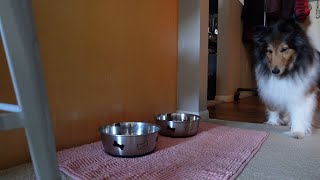
Heidi is Eating Her Supper
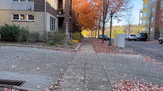
Fall Walk as the Leaves are Turning Colors

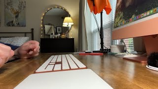
A Cup of Coffee in the Morning

Walking Heidi on a Sunny Day
Quiet Evening in St. Paul

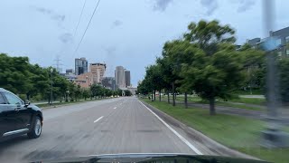
Driving in St. Paul in the Evening
A Clean Kitchen at the End of the Day

Cooking Tamales Low + Slow

Mild Summer Evening in St. Paul
The HTML
Responsive Video Gallery is a vanilla HTML, CSS and JavaScript project to make video gallerys with YouTube and Vimeo <iframe> embeds. Everything here is static, so you can use it as-is, or modfied to fit your project.
Each <article> has a <figure> with an <img> and a <button>. The <iframe> doesn't load in the grid. On click, a <dialog> element loads the video.
The <img src> is a YouTube (or Vimeo) thumbnail link. The following are examples of urls with ids, and how to find the <img src>.
						<!-- YouTube urls with video id -->
						https://www.youtube.com/watch?v=szRgEyiX6Sk
						https://youtu.be/szRgEyiX6Sk

						<!-- YouTube thumbnail src -->
						https://img.youtube.com/vi/szRgEyiX6Sk/mqdefault.jpg

						<!-- Vimeo url with video id -->
						https://vimeo.com/7533229

						<!--
						The Vimeo thumbnail src is embedded in the page source code.
						Right click on the Vimeo page and 'View Page Source'.
						Search for an og:image meta tag to find the thumbnail.
						-->
						<meta property="og:image" content="https://i.vimeocdn.com/video/632046499-3b7d2a63050fe87a8f3be5f58e4d913a36b3b2c84f9c19c67b055e98e6e4f05b-d?f=webp®ion=us">

						<!-- Vimeo thumbnail url -->
						https://i.vimeocdn.com/video/632046499-3b7d2a63050fe87a8f3be5f58e4d913a36b3b2c84f9c19c67b055e98e6e4f05b-d?f=webp®ion=us
The HTML is semantic and accessible:
						<!-- grid + wrap -->
						<div class="grid">
						  <!-- video container -->
						  <article class="article">
						      <!-- image container -->
						      <figure class="figure">
						        <!-- thumbnail image: update the video id + alt text -->
						        <img src="https://img.youtube.com/vi/szRgEyiX6Sk/mqdefault.jpg" alt="Deploy a Website to DigitalOcean 💧 LAMP + SFTP (FileZilla) + DNS Setup">
						        <!-- play button: update the video id + type -->
						        <button class="play_video" data-id="szRgEyiX6Sk" data-type="youtube" aria-label="Play Video">
						          <svg aria-hidden="true" xmlns="http://www.w3.org/2000/svg" viewBox="0 0 512 512">
						            <path d="M133 440a35.37 35.37 0 01-17.5-4.67c-12-6.8-19.46-20-19.46-34.33V111c0-14.37 7.46-27.53 19.46-34.33a35.13 35.13 0 0135.77.45l247.85 148.36a36 36 0 010 61l-247.89 148.4A35.5 35.5 0 01133 440z"/>
						          </svg>
						        </button>
						      </figure>
						      <!-- video title: adjust this for the template hierarchy -->
						      <h3 class="video_title">Deploy a Website to DigitalOcean 💧 LAMP + SFTP (FileZilla) + DNS Setup</h3>
						    </article>
						  </div>
The CSS
Next use vanilla CSS and CSS Grid to style the grid and the thumbnails.
						/* CSS Grid w/four columns */
						.grid {
						  display: grid;
						  grid-template-columns: repeat(4, 1fr);
						  gap: 2rem;
						}

						/* image container with 16:9 aspect ratio */
						.figure {
						  position: relative;
						  margin: 0 0 0.5rem;
						  width: 100%;
						  height: auto;
						  aspect-ratio: 16 / 9;
						}

						/* responsive thumbnail images */
						img {
						  width: 100%;
						  height: 100%;
						  object-fit: cover;
						}

						/* play button to create the iframe */
						.play_video {
						  position: absolute;
						  top: 50%;
						  left: 50%;
						  padding: 0.5rem 0.333rem 0.5rem 0.666rem;
						  border: 2px solid #2d5273;
						  border-radius: 50%;
						  background-color: #fff;
						  transform: translate(-50%, -50%);
						  transition: background-color 300ms ease-in-out, border 300ms ease-in-out;
						}

						svg {
						  width: 2rem;
						  height: 2rem;
						  fill: #2d5273;
						  transition: fill 300ms ease-in-out;
						}

						/* focus + hover states for play button */
						.play_video:focus,
						.play_video:hover,
						.play_video:active {
						  border: 2px solid #fff;
						  background-color: #2d5273;
						}

						.play_video:focus svg,
						.play_video:hover svg,
						.play_video:active svg {
						  fill: #fff;
						}

						.video_title {
						  font-size: clamp(1rem, 1.5vw, 1.1rem);
						  font-weight: 500;
						  letter-spacing: 0;
						  text-transform: none;
						  line-height: 1.5;
						}

						/* responsive grid columns */
						@media (max-width: 1024px) {
						  .wrap {
						    grid-template-columns: repeat(3, 1fr);
						    gap: 1rem;
						  }
						}

						@media (max-width: 768px) {
						  .wrap {
						    grid-template-columns: repeat(2, 1fr);
						  }
						}

						@media (max-width: 600px) {
						  .wrap {
						    grid-template-columns: 1fr;
						  }
						}
Next are styles for the <dialog> that holds the video <iframe>. The markup for the <dialog> and <iframe> are created with vanilla JavaScript (below).
						/* body class so page doesn't scroll when dialog is open */
						.dialog {
						  overflow: hidden;
						}

						/* dialog element */
						.dialog_modal {
						  max-width: min(100%, 150vh);
						  padding: 2rem;
						  border: 0;
						  background-color: transparent;
						}

						/* iframe container for styling */
						.dialog_frame {
						  width: 1200px;
						  max-width: 100%;
						  height: auto;
						  aspect-ratio: 16 / 9;
						}

						/* iframe that contains the video */
						.dialog_modal iframe {
						  display: block;
						  width: 100%;
						  height: 100%;
						}

						/* psuedo element for the dialog element */
						.dialog_modal::backdrop {
						  background-color: rgba(0, 0, 0, 75%);
						}

						/* button to close the dialog */
						.close_dialog {
						  padding: calc(0.5rem - 2px);
						  position: absolute;
						  top: 0;
						  right: 0;
						  border: 2px solid var(--white);
						  border-radius: 50%;
						  background-color: var(--black);
						  z-index: 3;
						  transition: background-color 300ms ease-in-out;
						}

						/* focus + hover for the close button */
						.close_dialog:focus,
						.close_dialog:hover,
						.close_dialog:active {
						  background-color: var(--white);
						}

						.close_dialog svg {
						stroke: var(--white);
						  transition: stroke 300ms ease-in-out;
						}

						.close_dialog:focus svg,
						.close_dialog:hover svg,
						.close_dialog:active svg {
						  stroke: var(--black);
						}
The JavaScript
						const body = document.body;
						const grid = document.querySelector(".grid");
						const videos = document.querySelectorAll(".article");
						if (!videos[0]) return;

						videos.forEach((video) => {
						    const button = video.querySelector(".play_video");
						    const title = video.querySelector(".video_title");

						    button.addEventListener("click", () => {
						        const dialog = document.createElement("dialog");
						        dialog.classList.add("dialog_modal");

						        const closeButton = document.createElement("button");
						        closeButton.classList.add("close_dialog");
						        closeButton.setAttribute("aria-label", "Close Video");
						        closeButton.innerHTML = '<svg aria-hidden="true" xmlns="http://www.w3.org/2000/svg" viewBox="0 0 512 512"><path fill="none" stroke="" stroke-linecap="round" stroke-linejoin="round" stroke-width="32" d="M368 368L144 144M368 144L144 368"/></svg>';

						        const container = document.createElement("div");
						        container.classList.add("dialog_frame");

						        const id = button.dataset.attribute;
						        const type = button.dataset.type;

						        const iframe = document.createElement("iframe");
						        iframe.title = title.textContent;
						        iframe.referrerPolicy = "strict-origin-when-cross-origin";
						        iframe.allowFullscreen = "";
						        iframe.frameBorder = "0";

						        if (type === "youtube") {
						            iframe.src = `https://www.youtube.com/embed/${id}`;
						            iframe.allow = "accelerometer; autoplay; clipboard-write; encrypted-media; gyroscope; picture-in-picture; web-share";
						        } else if (type === "vimeo") {
						            iframe.src = `https://player.vimeo.com/video/${id}`;
						            iframe.allow = "autoplay; fullscreen; picture-in-picture; clipboard-write; encrypted-media; web-share";
						        }

						        container.append(iframe);
						        dialog.append(closeButton, container);
						        grid.append(dialog);

						        dialog.showModal();
						        body.classList.add("dialog");

						        closeButton.addEventListener("click", () => {
						            dialog.remove();
						            body.classList.remove("dialog");
						        });

						        dialog.addEventListener("click", (event) => {
						            if (event.target === dialog) {
						                dialog.remove();
						                body.classList.remove("dialog");
						            }
						        });
						    });
						});
This is an example <dialog> element that's created and added to the DOM with JavaScript:
						<dialog class="dialog_modal" open="">
						  <button class="close_dialog" aria-label="Close Video">
						    <svg aria-hidden="true" xmlns="http://www.w3.org/2000/svg" viewBox="0 0 512 512">
						      <path fill="none" stroke="" stroke-linecap="round" stroke-linejoin="round" stroke-width="32" d="M368 368L144 144M368 144L144 368"></path>
						    </svg>
						  </button>
						  <div class="dialog_frame">
						    <iframe src="https://www.youtube.com/embed/BiKtBiHBQZQ"
						      title="Heidi is Perfect"
						      frameborder="0"
						      allow="accelerometer; autoplay; clipboard-write; encrypted-media; gyroscope; picture-in-picture; web-share"
						      referrerpolicy="strict-origin-when-cross-origin"
						      allowfullscreen="">
						    </iframe>
						  </div>
						</dialog>